I don't think anyone today would attempt to write a book on a typewriter, such is the convenience and ubiquity of word processing software. So, with all of these advanced features to draw upon, why do authors keep on sending me manuscripts in which they've used MS Word, Libreoffice or similar like a typewriter?
Here's the problem; they fill the manuscript with manual formatting. When they create a chapter title, or a subtitle, they select the text, change the font, change the font size, centre the paragraph and so on. As a publisher, this means I have to take all the formatting out and start again, and that greatly lengthens the time required to get a book into print.
Word processing software isn't meant to be used like that, and it's a nightmare to work with. Therefore, I thought I'd make a little video and tutorial to give you some ideas for the complexity of formatting that you can easily achieve with styles.
First, what's a style? It's a description of a recurring format. Let's say you want all your chapter headings to be bold, 20pt size, Arial font. Instead of manually applying that to each chapter heading, you simply set those style elements to be part of a style called 'Heading 1', then simply apply Heading 1 to every chapter title. If you later decide you don't like Arial, you simply change the style and all of the chapter titles magically change at the same time.
More than that, you can set the style to put a page break before each heading, and to start each chapter with a particular page style, so that you can have all of your chapters starting on a left page with a fancy border.
If you're using Libreoffice, which I highly recommend, all you have to do to set a chapter is type your chapter title and press 'Control 1' (hold the control key down and press 1) and the correct styling magically appears.

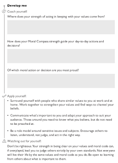
Here's an example of styling that an author recently requested:
Looks complicated, right? Their graphic designer made this, no doubt by manually placing all of the different elements that you see.
It's typical of what a graphic designer produces. Authors often think that graphic designers know what's best about visual layout. That's not true, at least not where books are concerned. The bullet points, for example, in the 'Apply yourself' section are redundant, take up space and interrupt the reader. The format is already a bulleted list, we don't need more bullets inside it. This isn't a powerpoint presentation.
You might be thinking that this type of formatting would be impossible on a word processor, but in fact it's easy to produce once you know how to use styles. The book that the above page is taken from had 60 chapters of two pages each, and each of those needed the same formatting. If that had been done manually, the book would have taken weeks to format. With automatic styles, it took about half an hour.
This video is a real time screen capture of the sequence for producing the formatting above:
All I had to do was the select the text and apply the style. To make things even easier, I assigned the styles that I needed to keyboard shortcuts so I didn't even need to move the mouse once I'd selected the text.
Here are a few other screenshots to show you some of the tricks.
First, those grey boxes. You don't need to manually insert floating boxes (which are horrible to work with) or tables (which are hard to automate). All you need is to make the background of the paragraph a pale grey colour and you have a grey box. Change the font size to make the box bigger or smaller.
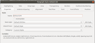
 A neat way to add them in the example above is to use Libreoffice's ability to know which order styles should go in. This means that whenever you style a title, for example, and then press return, the next line will automatically be your default paragraph style.
In this example, the paragraph has a style with a left line border to produce the vertical line, and when I press return at the end of the line, the next paragraph is the style that produces the grey box.
Second, how does the grey box look indented? If I made it using a paragraph background, the grey would extend all the way to the black line, which isn't what the author wants. I used Inkscape, another amazing open source program, to create the following image, a grey rectangle with a white area to the left:

Instead of making the paragraph background a fixed colour, I made it the grey box image above. The white area makes it look like the box is indented, when really the image touches the black vertical line.

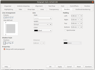
Here's the paragraph style showing the black left border. Note the padding figure which causes the text to indent. As long as adjacent paragraphs have the same indent, the borders will join together, creating the impression of the vertical line. Neat, eh?
If you're writing a book manuscript, or any kind of complex document, I highly recommend that you download Libreoffice. It's open source, which means free, and is far superior to MS Word. For a start, it's free. Also, the support is far better, the features are better, it's more reliable, it creates standard format documents (ODT) rather than proprietary format (DOCX) and it's easier to use, despite MS's best efforts to turn the Word interface into a Fisher Price 'My first word processor'.
Get to know how to use styles and your time investment will be paid back many times over in terms of productivity and in the consistency and quality of your final document.
____________________________
CGW Publishing is an independent publisher specialising in business and non-fiction books for authors who want to build a service business around their intellectual property. We work with a wide range of experts with a breadth and depth of credibility in fields such as sales and marketing, performance psychology, recruitment, coaching and training, IT and ecommerce and business consulting.
www.cgwpublishing.com


